This project explores fashion presentation as a form of storytelling. The selected works focus on final styling and visual outcomes, examining how garments and references are curated into a cohesive narrative through composition, mood, and sequencing.
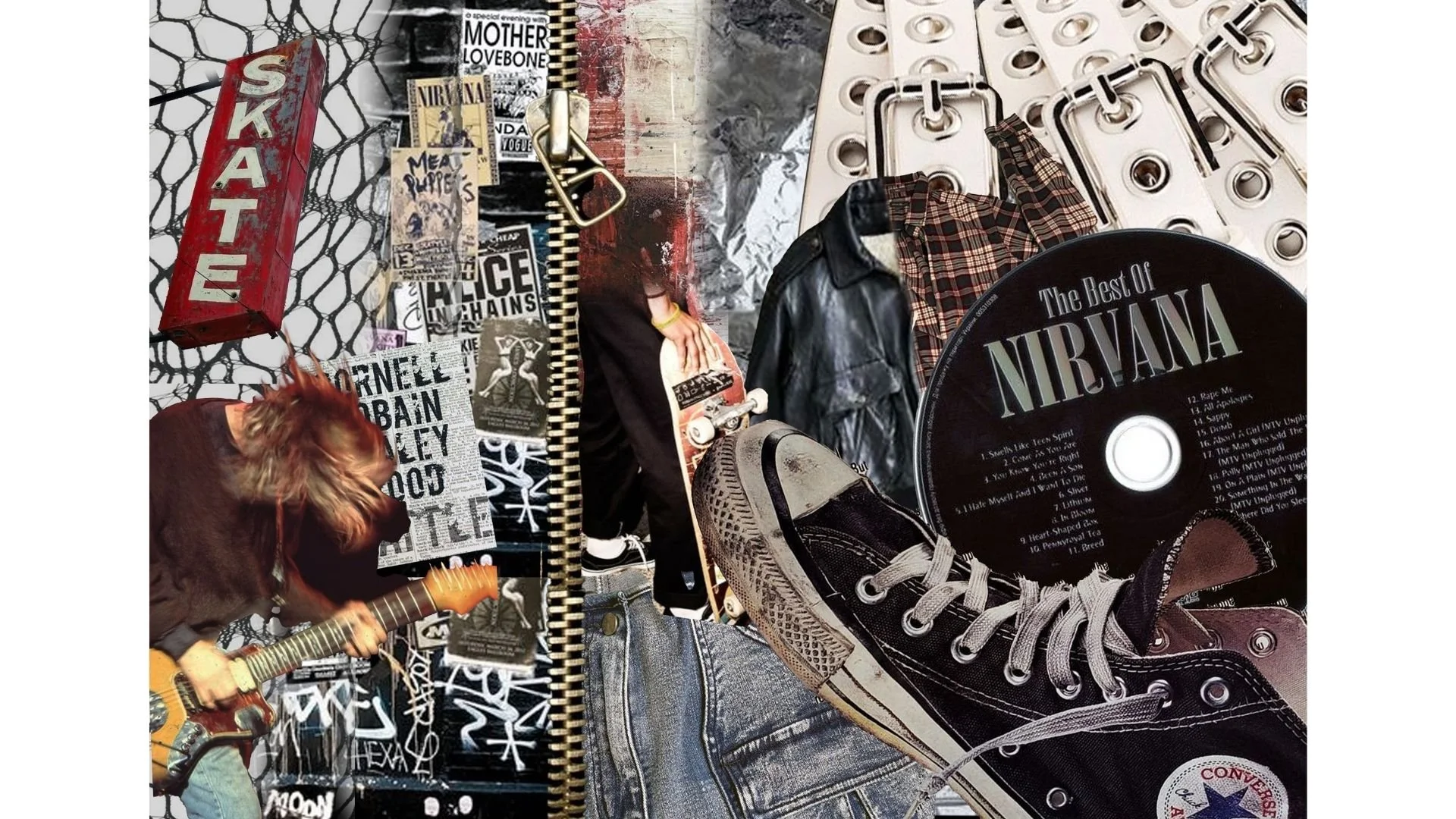
Inspired by retro grunge references, this moodboard reflects an interest in revisiting past aesthetics to inform new ideas. The emphasis is on texture, layering, and visual tension, using grunge as a foundation for experimentation rather than reproduction.
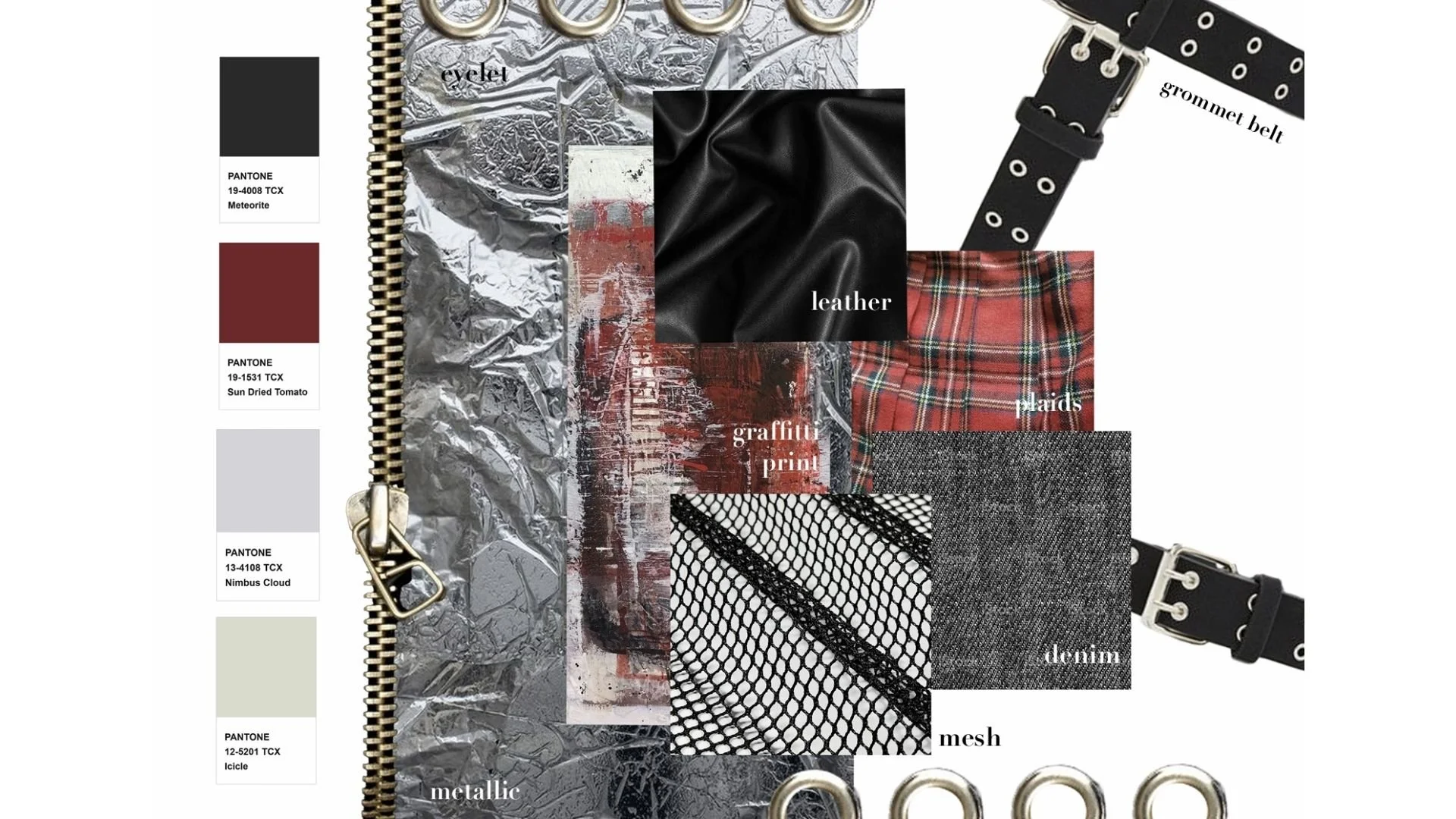
Material exploration centred on denim, leather, mesh, and metallic elements, chosen for their association with grunge styling and visual texture. Hardware details were introduced to enhance contrast and add an industrial edge to the overall design direction.
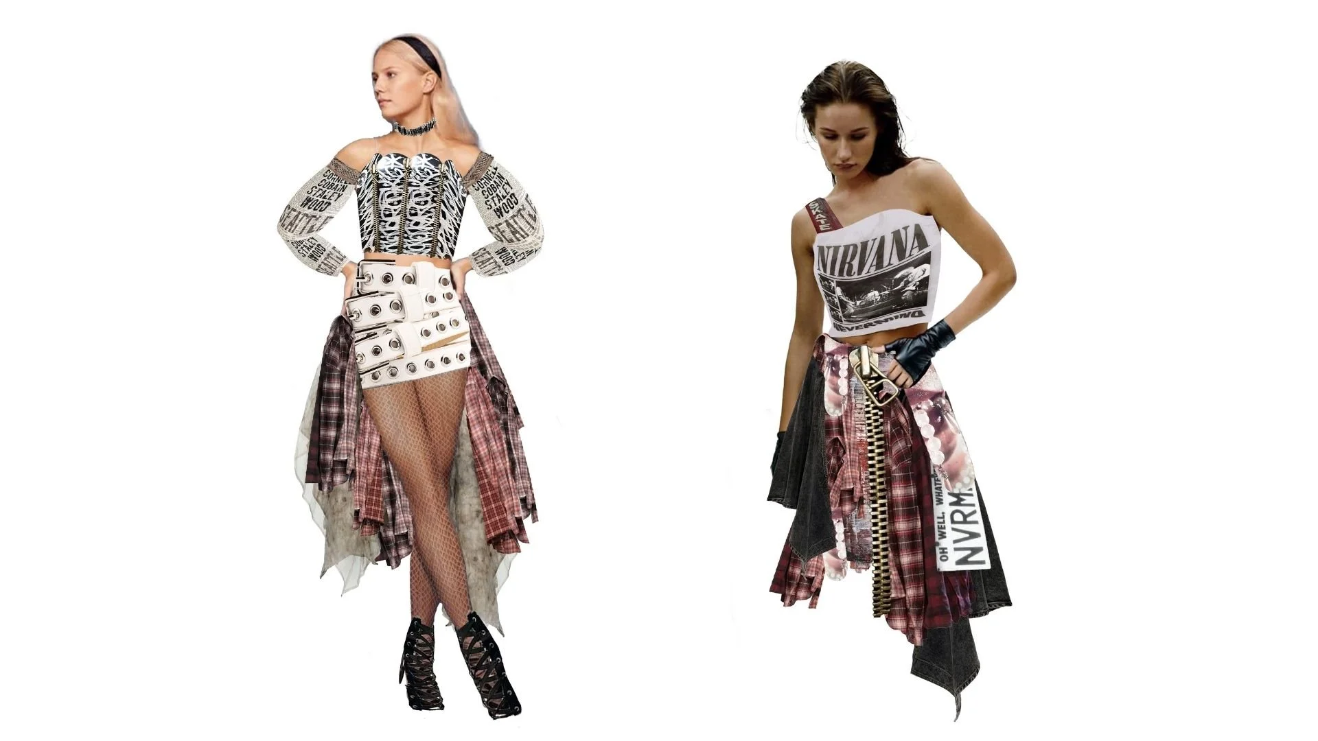
Outfit development was explored through digital cut-and-paste techniques, combining elements from selected fashion eras associated with grunge culture. Existing garments, textures, and details were reassembled digitally to study proportion, layering, and styling. This process allowed experimentation with form and visual balance before translating ideas into more developed outcomes.
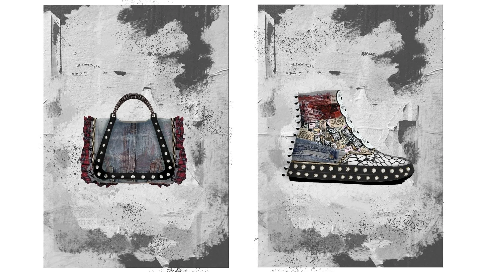
Accessories and product designs were developed using the same cut-and-paste approach, extending the grunge concept beyond garments. Bags and footwear were designed to complement the outfits through material contrast, hardware details, and layered textures, reinforcing the overall visual language of the collection.
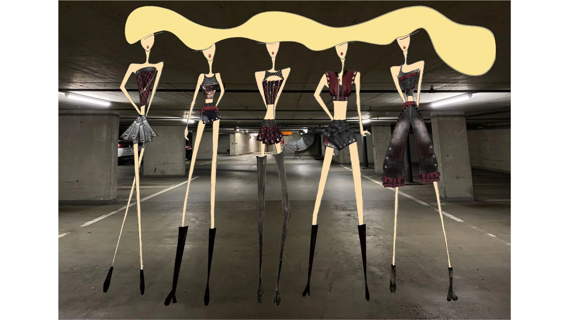
The final looks were presented on illustrated mannequins to allow greater control over proportion and styling. A carpark setting was chosen to introduce a gritty, urban atmosphere, drawing inspiration from K-pop stage and album concepts. The environment supports the experimental nature of the designs, positioning them as performance and concept-driven rather than conventional ready-to-wear pieces.
This project explored form and material through experimental manipulation. The assignment focused on creating sculptural outcomes rather than functional or wearable products, encouraging an artistic approach to material exploration.
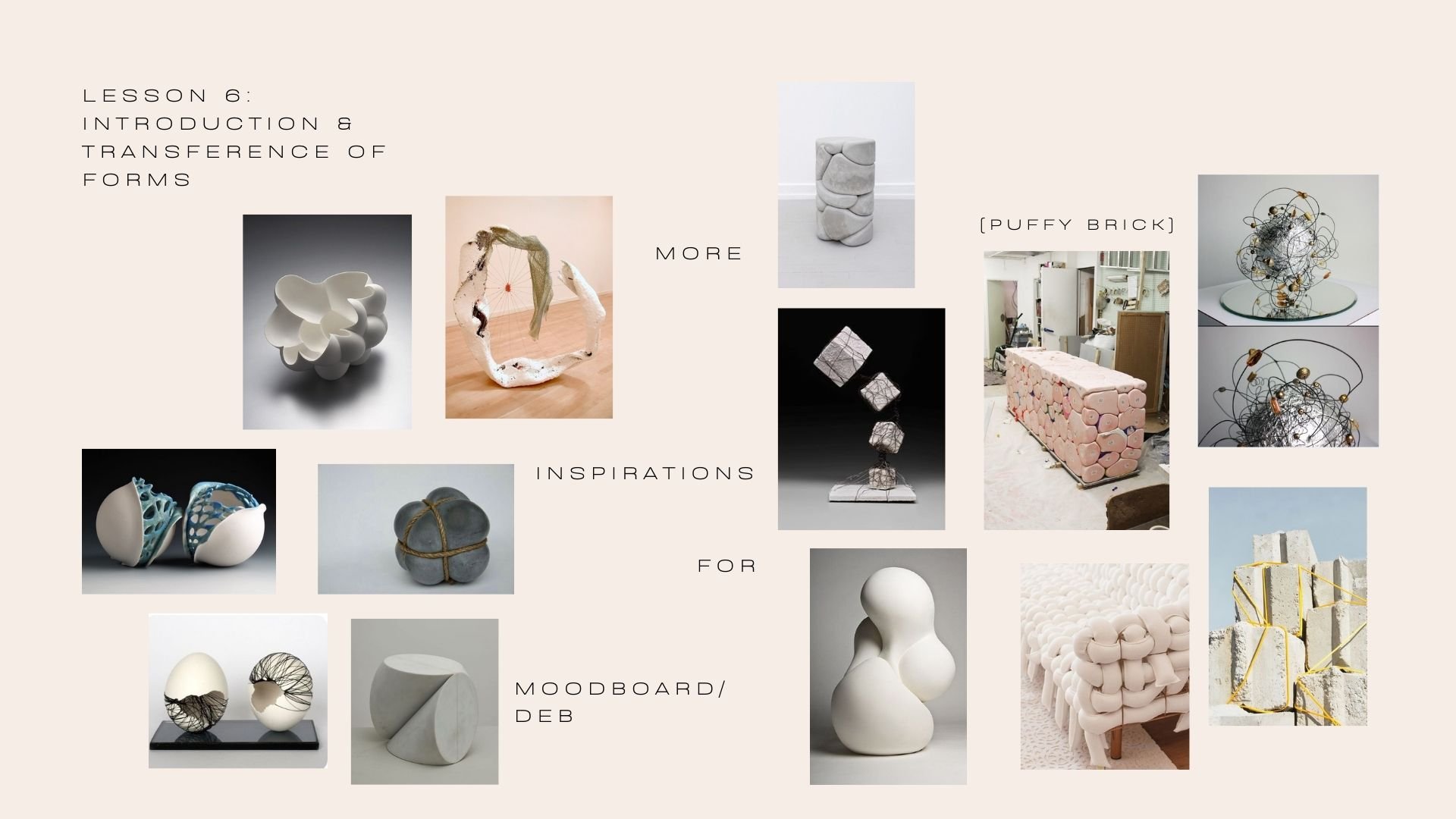
Working hands-on with selected materials, I experimented with folding, layering, and assembling forms to study texture, structure, and volume. The process prioritised visual and tactile qualities, allowing the material to guide the final outcome.
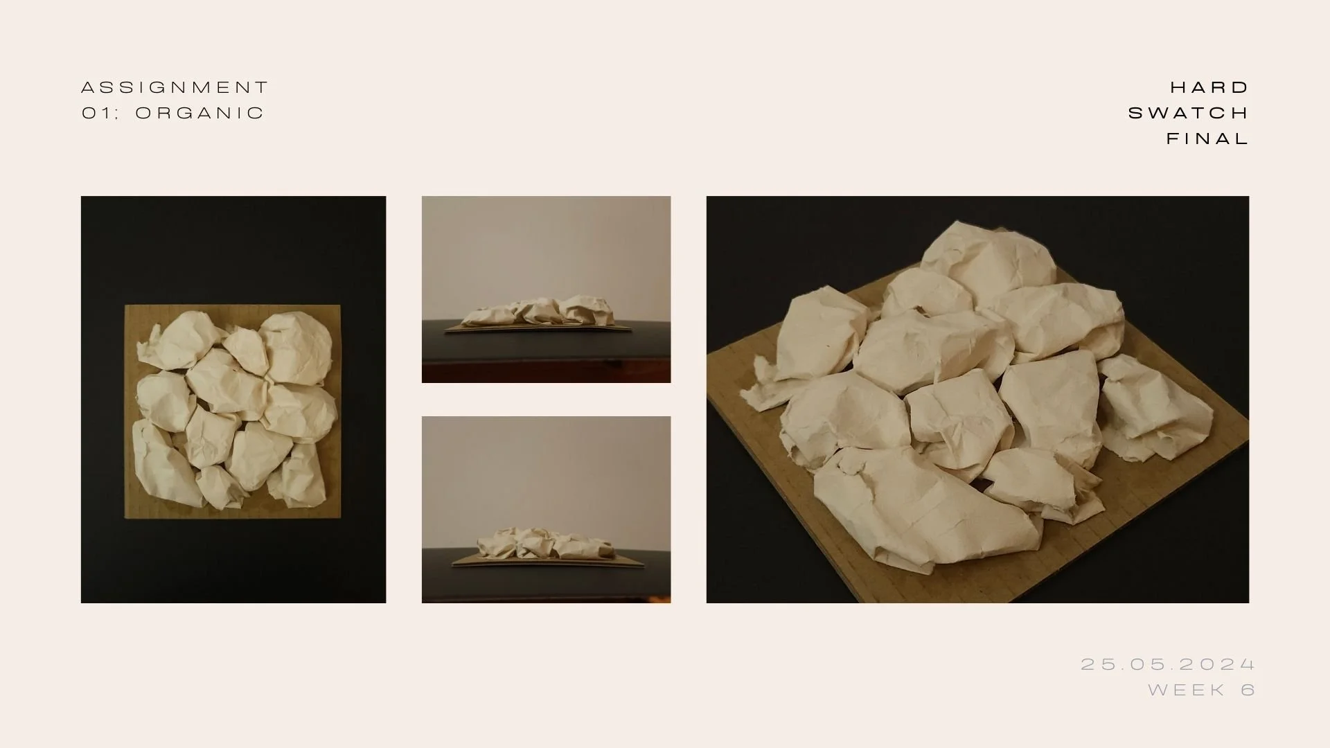
The swatch was inspired by organic buildings, interiors, and the textures typically found on interior walls; it has a structure-like appearance. I used paper as the hard material, crushing it up and spraying it in water to soften it. This gave the paper a unique texture that resembled stucco or concrete. The swatch then took on a rugged appearance that suggested it was constructed of a much heavier material. The finished product captured the essence of natural architecture and was aesthetically pleasing.
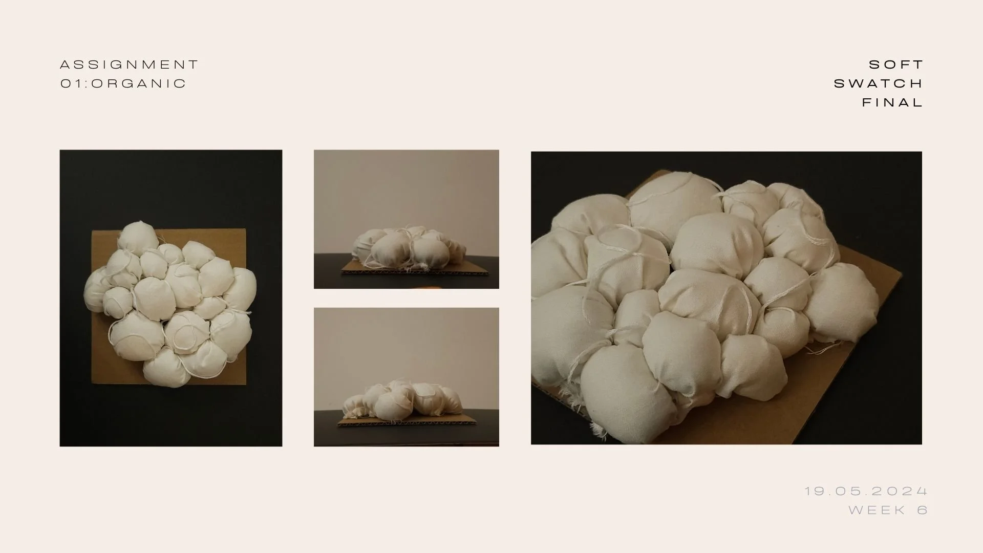
Inspired by fabric manipulation similar to the bubbling technique, I created the texture by sewing each ball and combining them together. The texture was created with cotton fabric stuffed with recycled cotton, giving it a round look and a soft, plush feel. The string was added to make it look less flat while giving it a sense of dimension. This combination of materials also adds dimension and depth to the overall design.
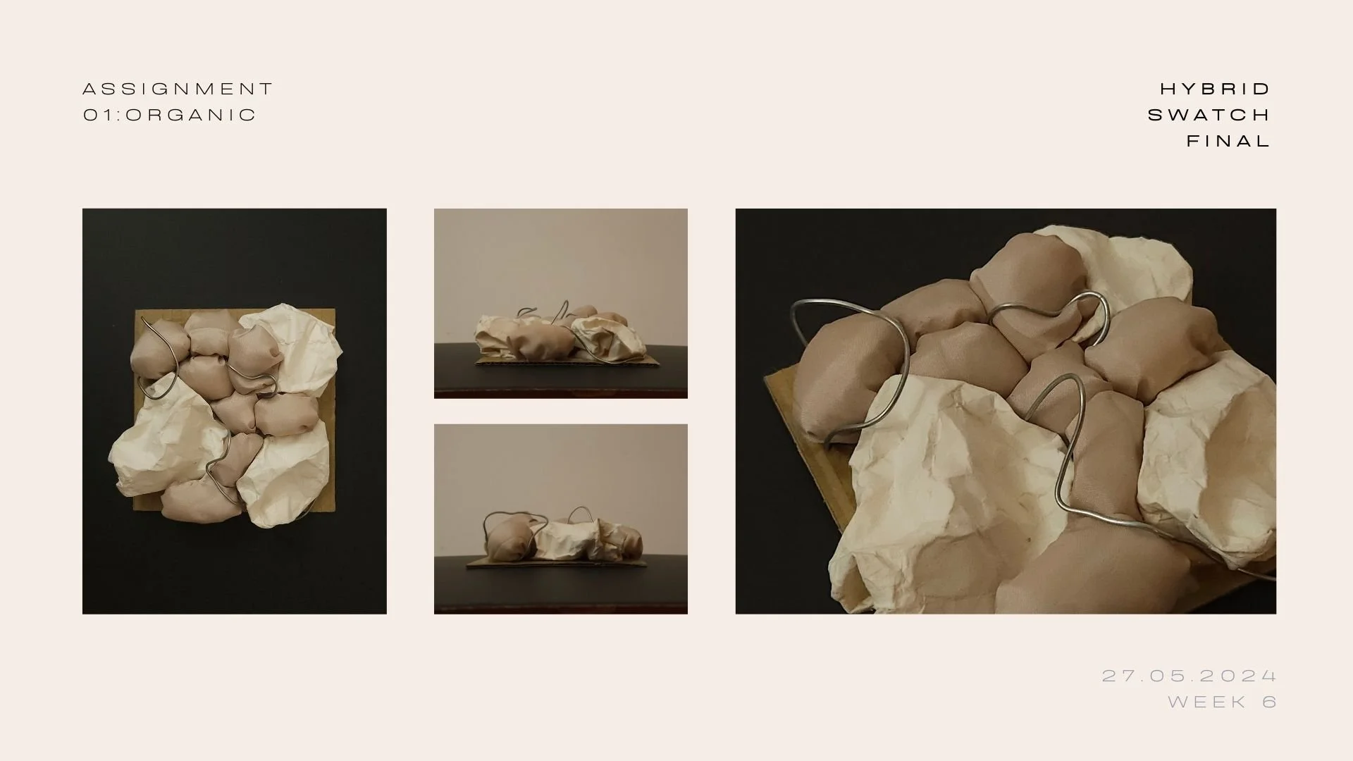
To show the harmony between the soft and hard elements, I chose to substitute the crochet yarn from the soft swatch into bendable wire while maintaining and combining both hard and soft swatches. This allowed me to create a piece that blends the delicate nature of the wire into the swatch, resulting in a unique and balanced design. The contrast between the two materials adds depth and visual interest to the final product.
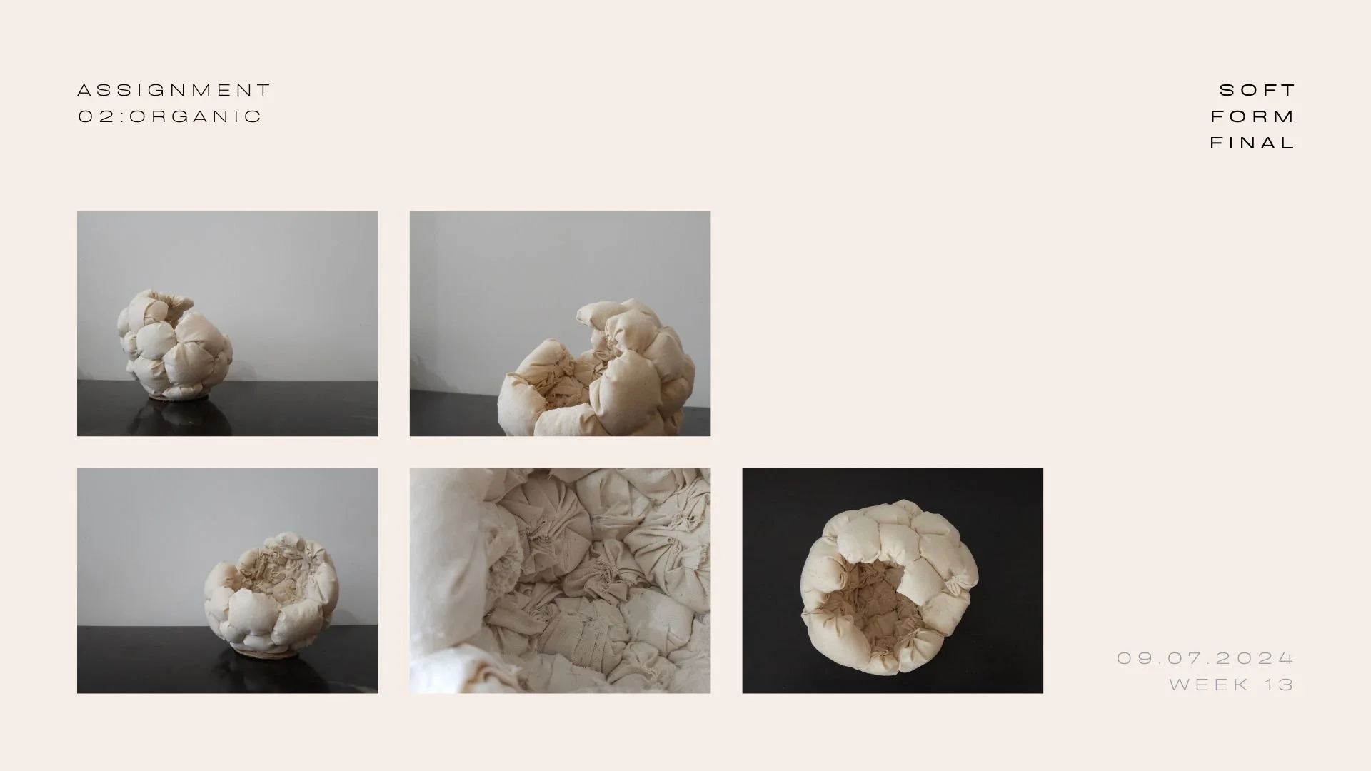
Inspired by the strong yet soft texture of puffy bricks, carefully made from sewn fabric balls using calico fabric. Through this sphere piece, I want to convey a sculpture that has a stone-like quality, combining the strong and delicate elements of the puffy brick. The unfinished, cracked surface shows the breakdown or corrosion, suggesting the evolution of a stone. Each fabric ball is carefully placed to mimic the natural irregularities found in real bricks, creating a sense of authenticity and craftsmanship. The contrast between the soft fabric and the hard appearance of stone adds depth and complexity to the overall piece.
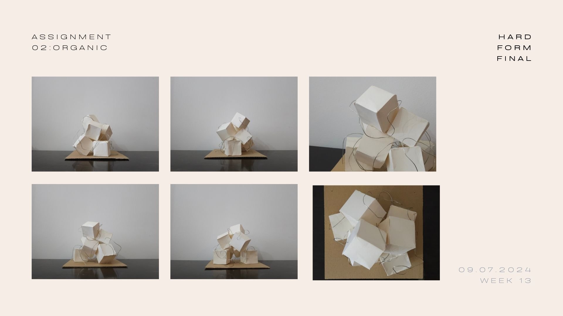
This cube form, created with craft paper. Water was dabbed to create the texture and impression of it not being angled. When rotated, it can capture light and shadow from different angles, showing the different facades of form. The cubes are placed strategically because I want to show a sense of trust between them in the arrangement. Wires are there to show a sense of connection and entanglement between the cubes. My aim is then to invite viewers to explore the sculpture from all angles.
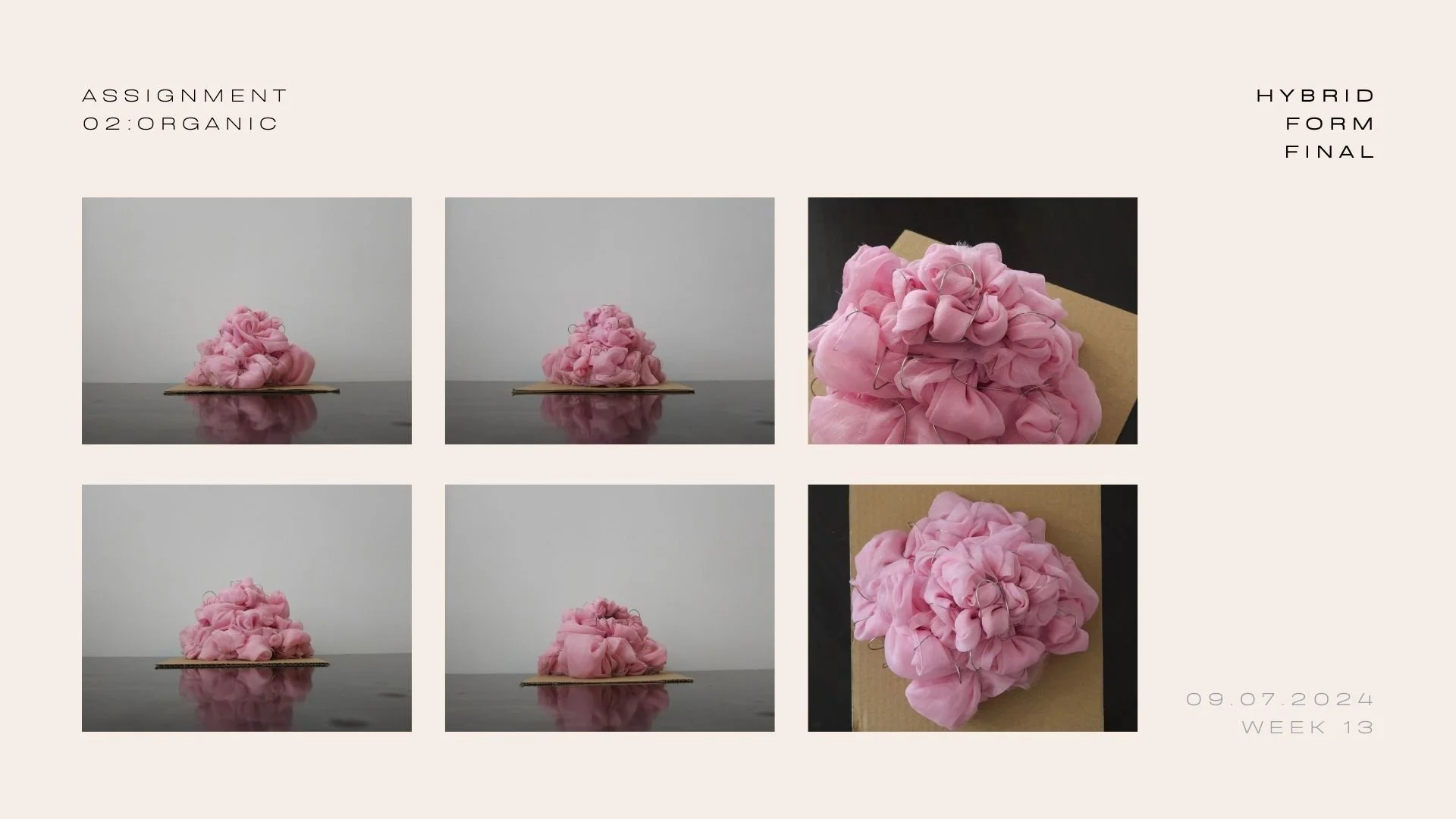
This cone form was transformed into a pyramid created from chiffon fabric delicately entwined with wire. The transparency in the chiffon fabric creates a sense of balance and harmony. This combination of structure and softness can be seen in this sculpture. The wire then creates a distinctive contrast that draws the eye by adding a hint of stiffness to the otherwise flowing fabric. Swirls in the fabric also add an element of whimsicalness to the overall design.
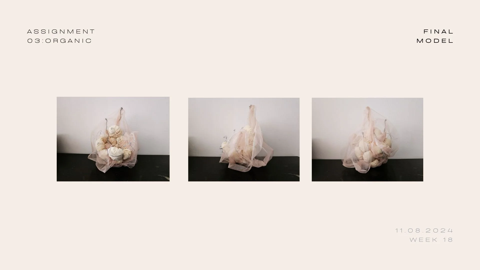
Continuing my own previous assignments, I am inspired by the materials and techniques used by artists that I was influenced by to create a more creative and interesting piece.
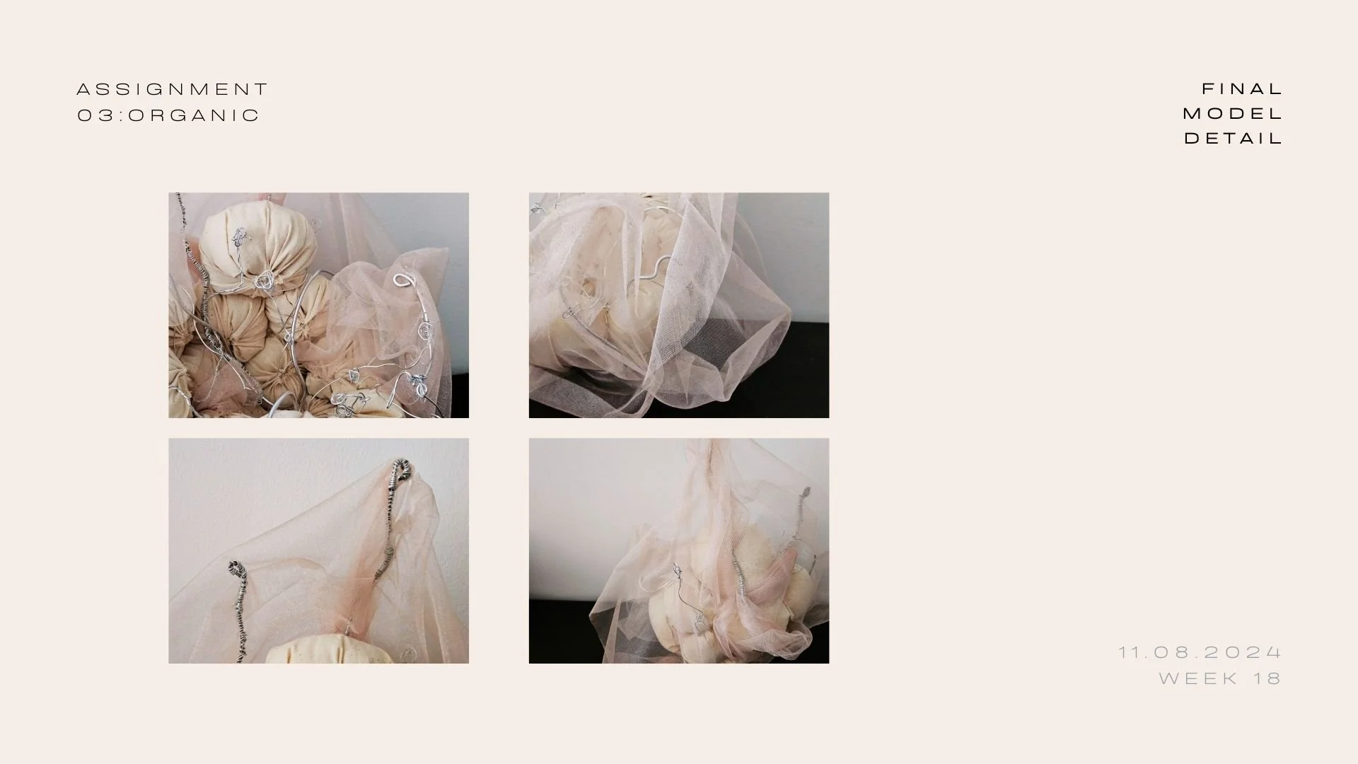
By exploring new methods and trying to push the boundaries of my previous art forms, I created a decorative standing art piece. The main focus being the centre, which was decorated with different types of wire before gradually "growing" out, which signifies a thought that inspired the artwork: 'No matter how miserable things is, growth will always happen, be it good or bad' This is to tell people that life can bring challenges and obstacles, but growth and change are inevitable. Fabric was added to play with the whimsicalness that i wanted to convey along with how the wires are placed.
This project began as an exploration of colour and visual language through research and pattern development. Starting from turquoise as a key reference, I studied its cultural associations, emotional qualities, and retro influences. These insights were translated into geometric motifs and surface designs, experimenting with repetition, rhythm, and balance. Rather than aiming for a final product, the focus was on understanding how colour and form can communicate mood, nostalgia, and expression.
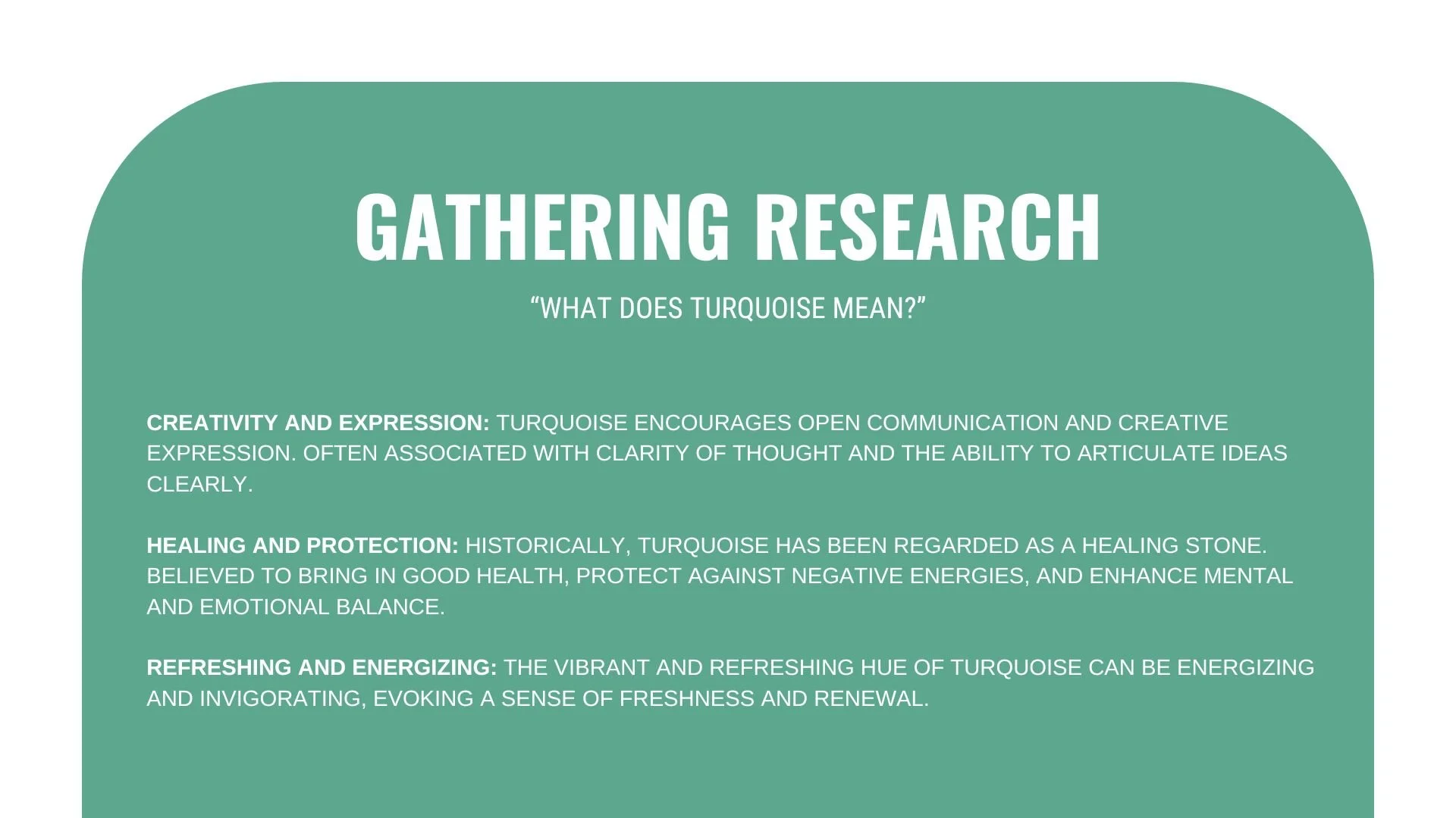
Initial research focused on understanding the emotional and symbolic meanings associated with the colour turquoise.
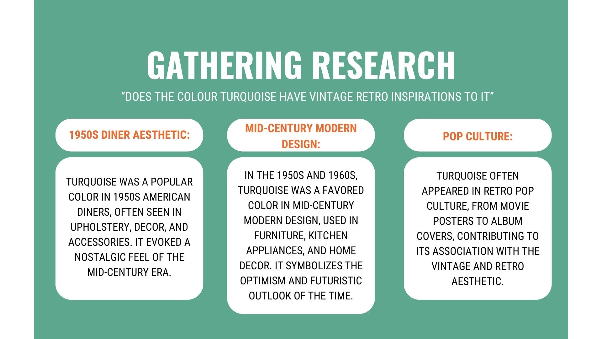
Research explored how turquoise appears across vintage and retro references, particularly within 1950s diner culture, mid-century design, and pop imagery.
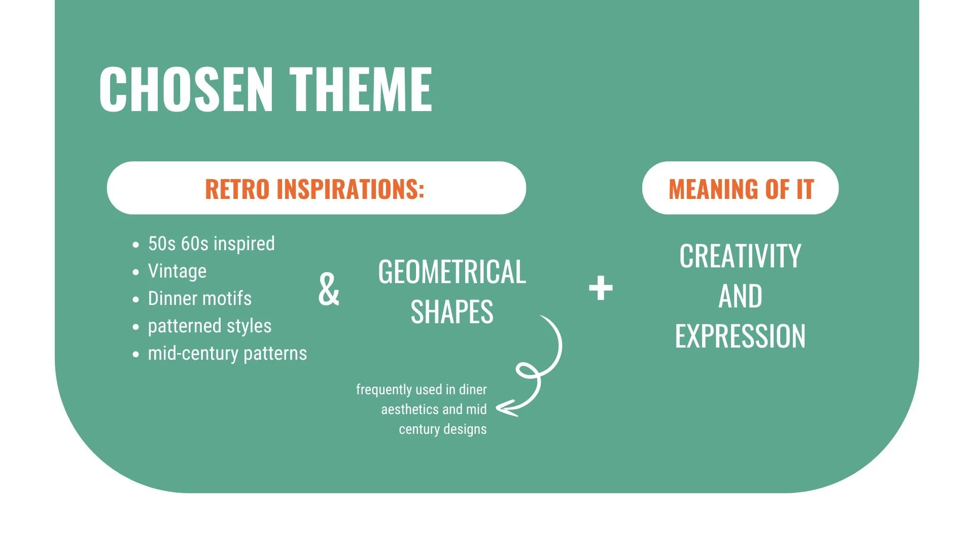
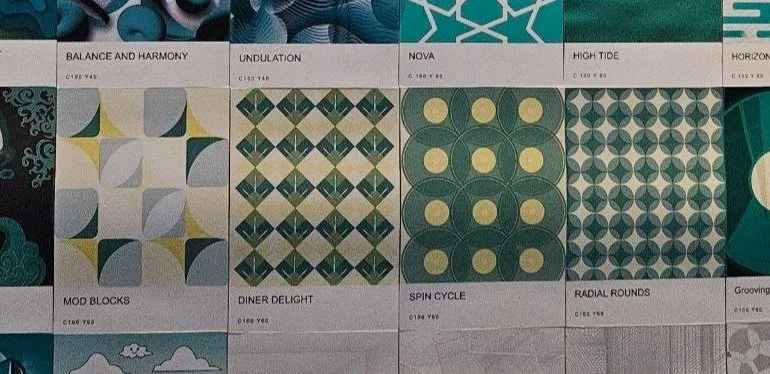
These references informed the final theme direction, combining retro diner influences with geometric forms and expressive colour choices.
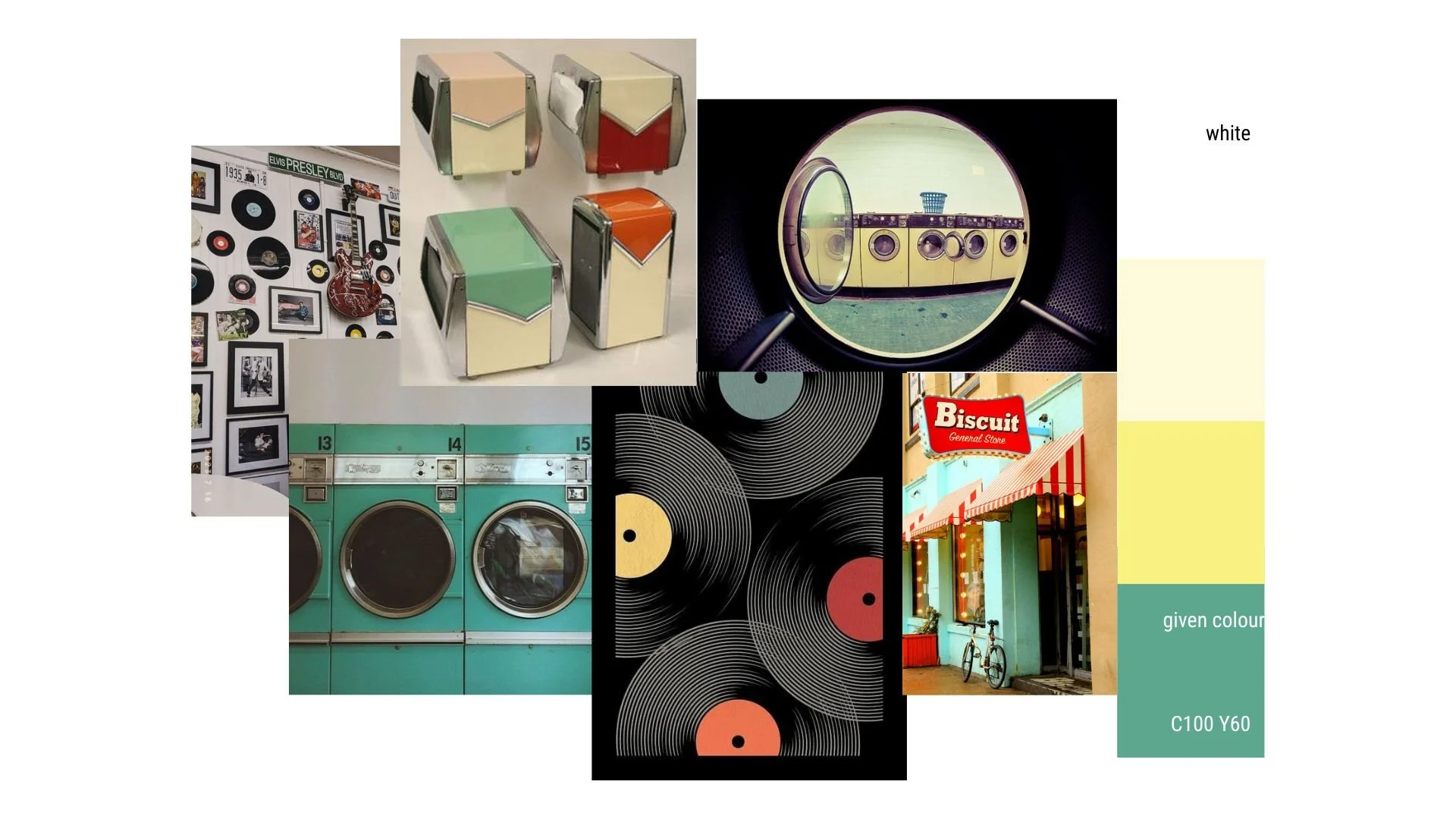
Moodboard bringing together colour, form, and visual references to guide pattern development.
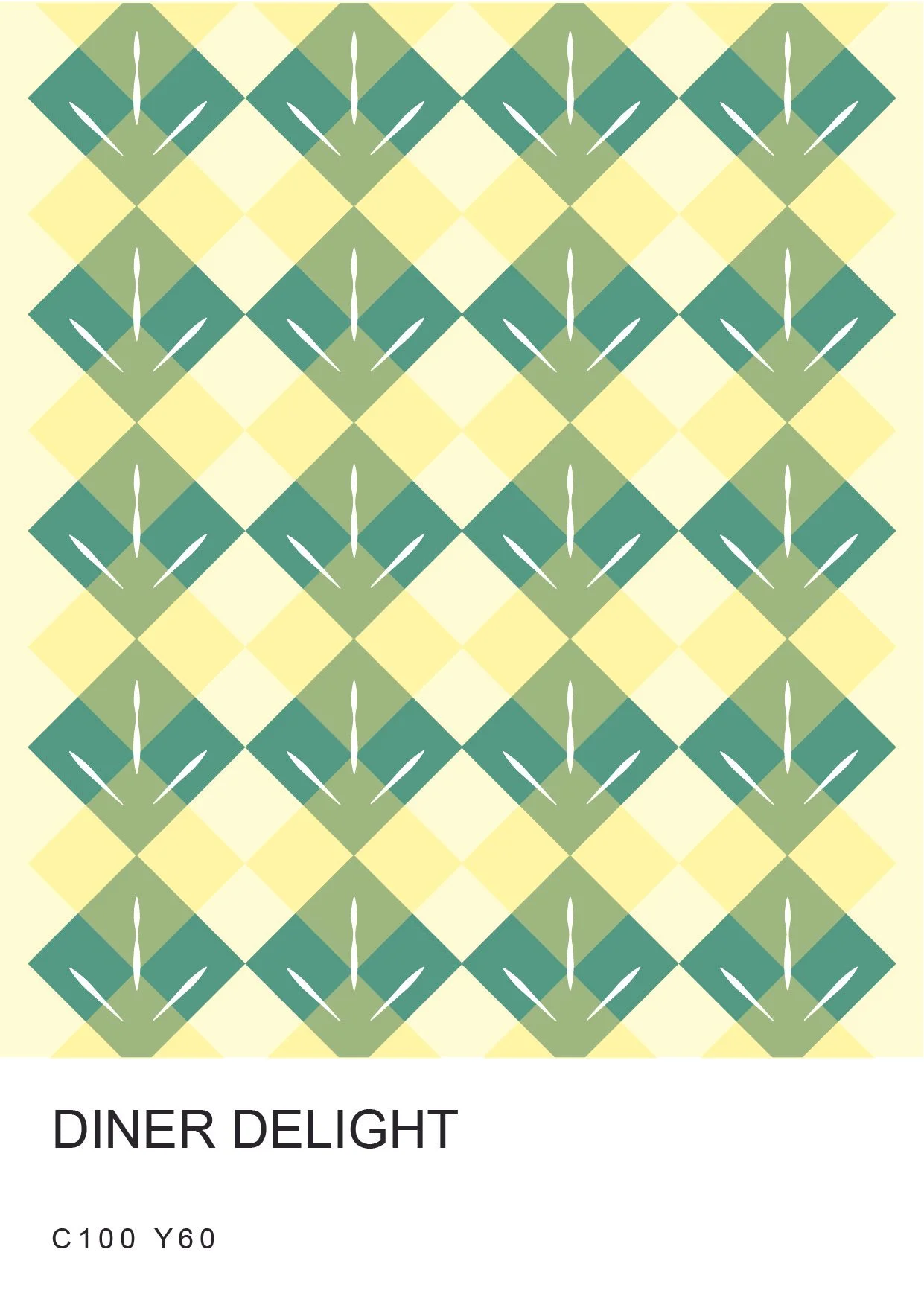
Inspired by 60s diner aesthetic, I created a blend of turquoise and yellow squares. To show the lively and bold pattern, I mixmatched the shape with lines on the main coloured square - turquoise evoking a sense of fun. The choice of turquoise and yellow reflects the cheerful and energetic atmosphere of classic diners.
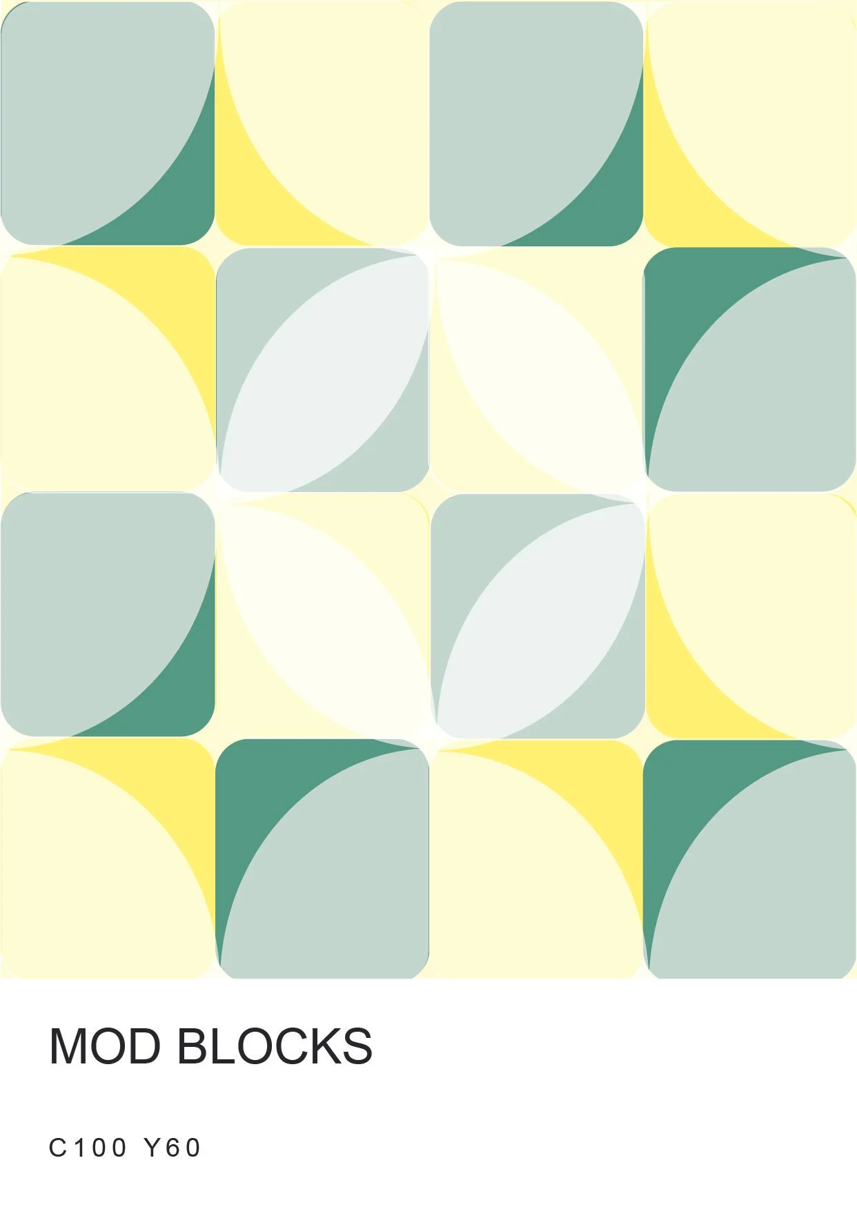
Similar to the first design but instead of sharp edges, I went with something more soft and rounded, which explains my usage of translucent circles. My aim is to show that one is able to imagine this design on a table top/ floor pattern or a poster for a retro diner resturant. The colour choice is intended as it matches/pairs with the given colour (turquoise) instead of drowning it out.
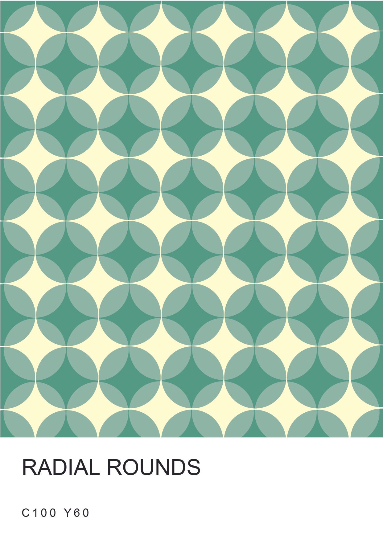
I came up with this design by visualising how it would look as a table top pattern. By overlapping the circles, it created a sense of harmony and illusion. It is to recreate the retro aesthetic of the 1950s, while also incorporating a modern appeal. The design is then both nostalgic and fresh while contributing to the diner atmosphere.
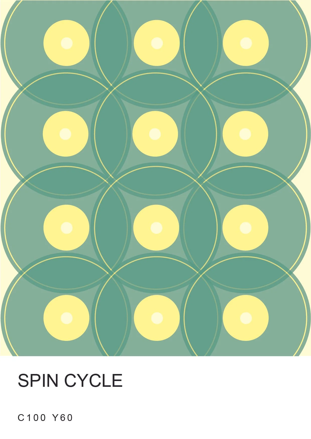
IInspired by retro vinyl records, and just like the previous designs, to show the sense of nostalgia and livelyness, I overlapped each disc and lowered the opacity to show another design layer underneath. The result adds depth and dimension and, at the same time, a modern twist to the overall aesthetic of the design, making it feel fresh and engaging.
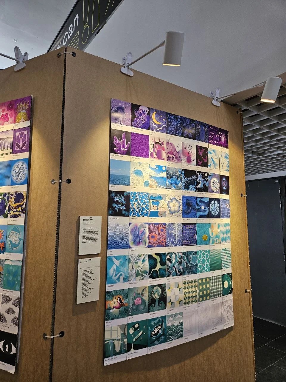
My individual work displayed as part of a group exhibition during the Aesthetic Design module.
This project was developed during my Year 1 textile module under the theme of aesthetic experimentation. I chose space as my core inspiration, focusing specifically on planets due to their diverse surfaces and textures. Rather than approaching space in a factual manner, this project explores personal interpretation, allowing textures and techniques to represent emotions, atmospheres, and imagined environments.
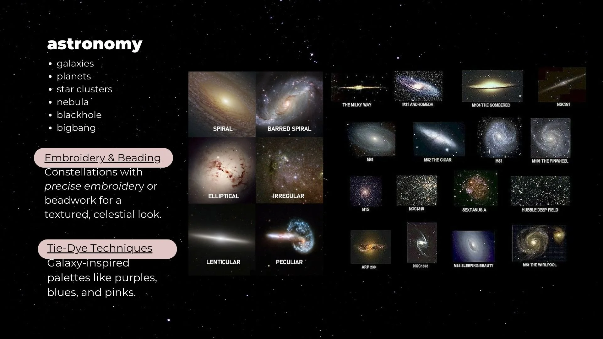
The research board explores astronomy as a visual reference, focusing on galaxies, planets, and cosmic formations. These elements were studied for their colours, structures, and surface qualities, providing a foundation for translating celestial imagery into textile-based experimentation.
My moodboard interprets space as an atmospheric and abstract environment rather than a literal depiction. Inspired by nebulae, planetary surfaces, and galaxy formations, it emphasises layered textures, fluid movement, and cosmic colour palettes, guiding the use of techniques such as tie-dye, embroidery, and beading.
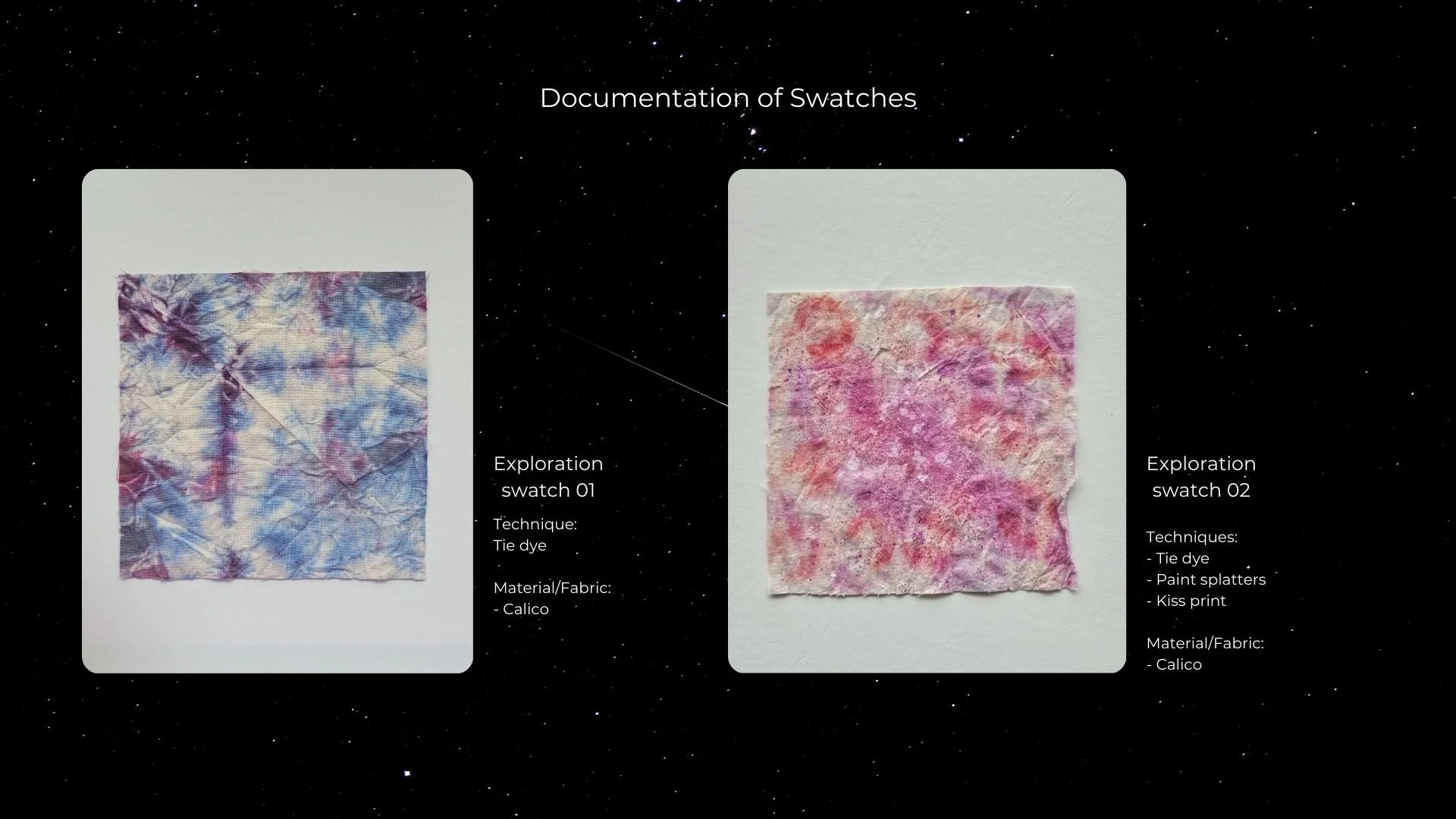
The first two swatches explore flat textile experimentation inspired by nebulas and the general atmosphere of space. Techniques such as tie-dye were used to create organic, fluid patterns that reflect the vastness and softness of the cosmos, without referencing any specific planetary surface.
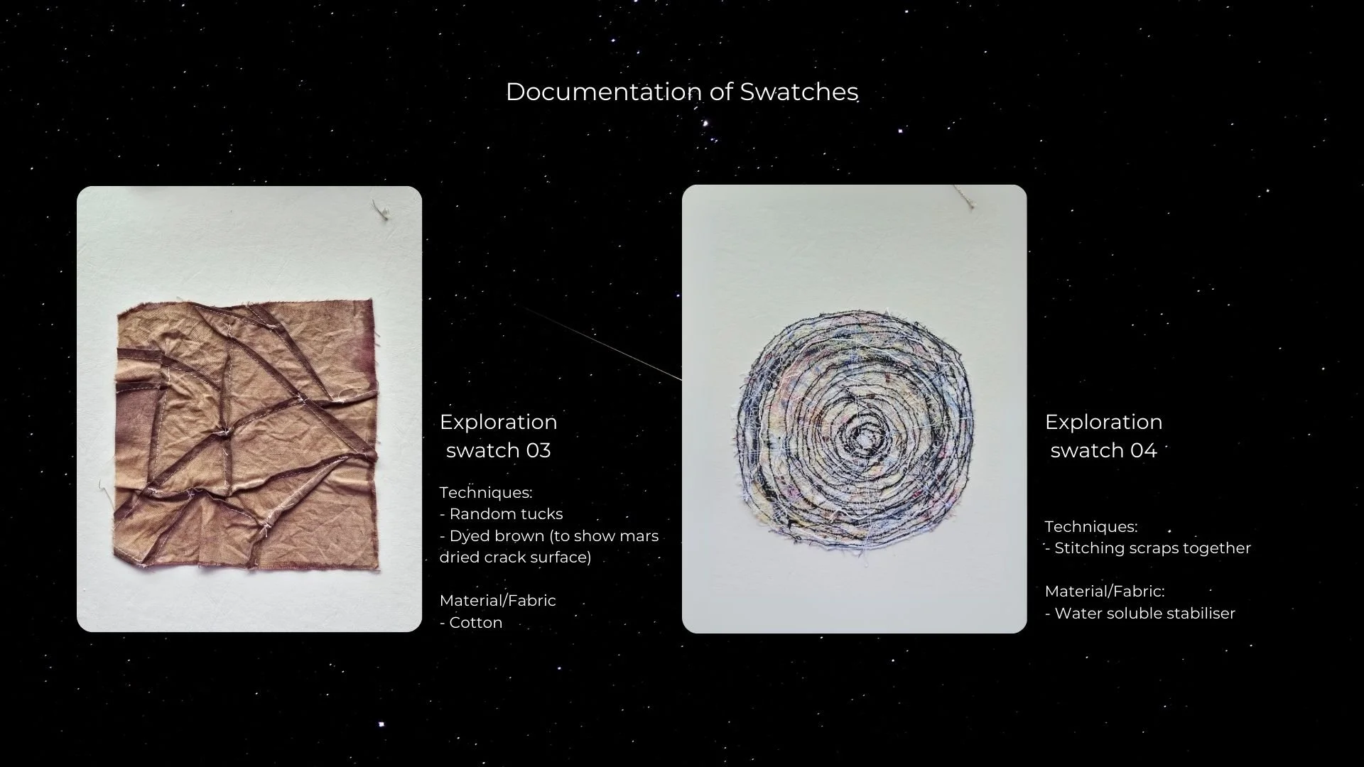
The third swatch interprets the dry, cracked surface of Mars through dyed fabric manipulation, emphasising texture and dryness. The fourth swatch presents a more stylised and illustrative interpretation of a planet, moving away from realism and allowing freedom in form and expression.
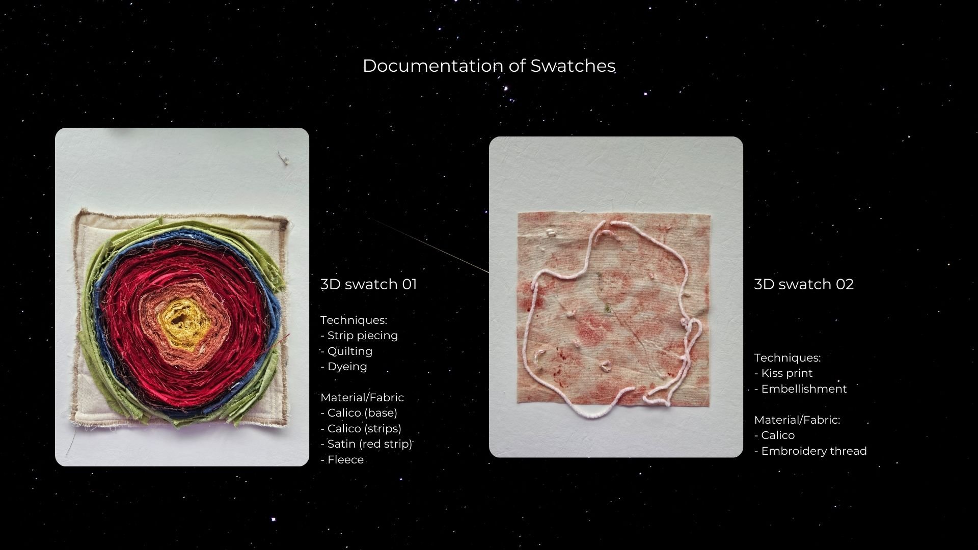
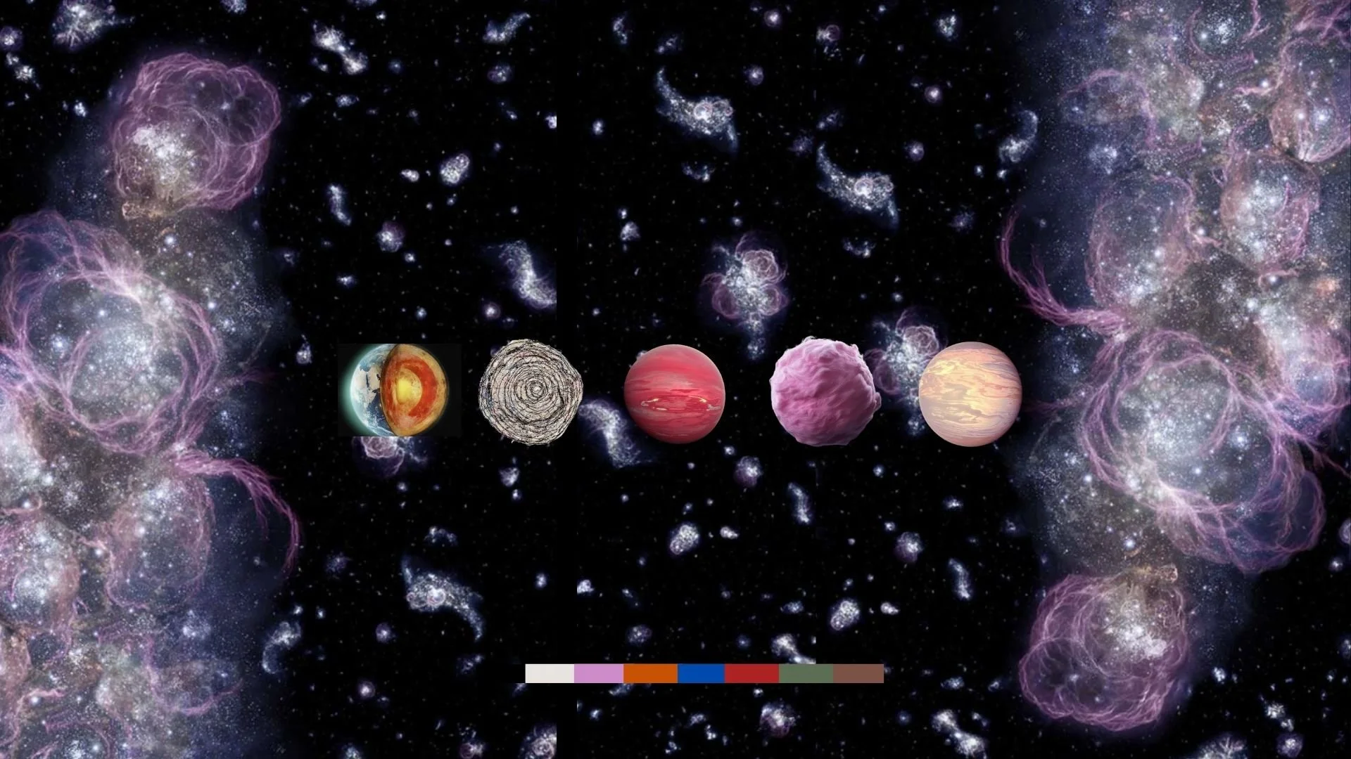
The first 3D swatch represents the Earth’s core through a thick, layered construction. Strip piecing, quilting, and dyeing were combined to create depth and density, reflecting the layered structure and intensity beneath the Earth’s surface. The second 3D swatch draws inspiration from Venus, interpreted through softer forms and warmer tones to convey a sense of romance. Embellishment and surface manipulation were used to create a gentle yet expressive texture, reflecting Venus as a planet often associated with beauty and emotion.
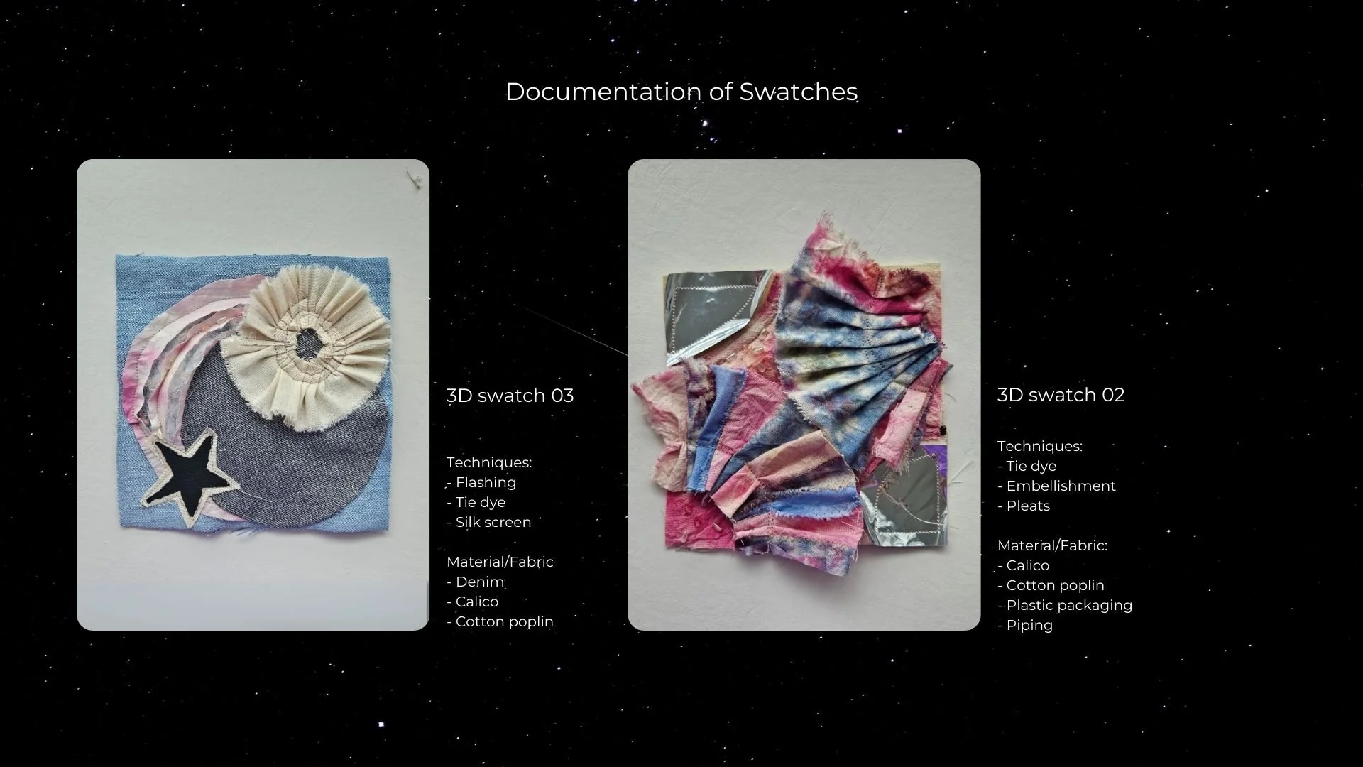
The final swatches take on a more abstract and playful approach, reflecting my personal interpretation of space. These designs move towards a more stylised and animated aesthetic, combining pleating, metallic elements, and layered textures. Rather than representing space realistically, the swatches explore imagination, allowing space to exist as a personal and expressive universe.